horizon organic
Challenge: Build a master brand evolution that champions the change for better food communities. We lead the organic dairy category, but we want to be known for leading the charge of positive change through food: being synonymous for creating food that nurtures people and takes care of the planet. Along the way clean up shelf presence to be more consistent and easier to navigate.
Role: Design strategy, Creative direction, Project management, Pillar strategy, Design, Writing. In conjunction with Elmwood agency and internal teams as the lead.
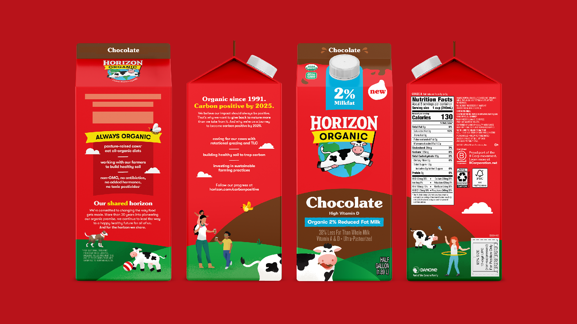
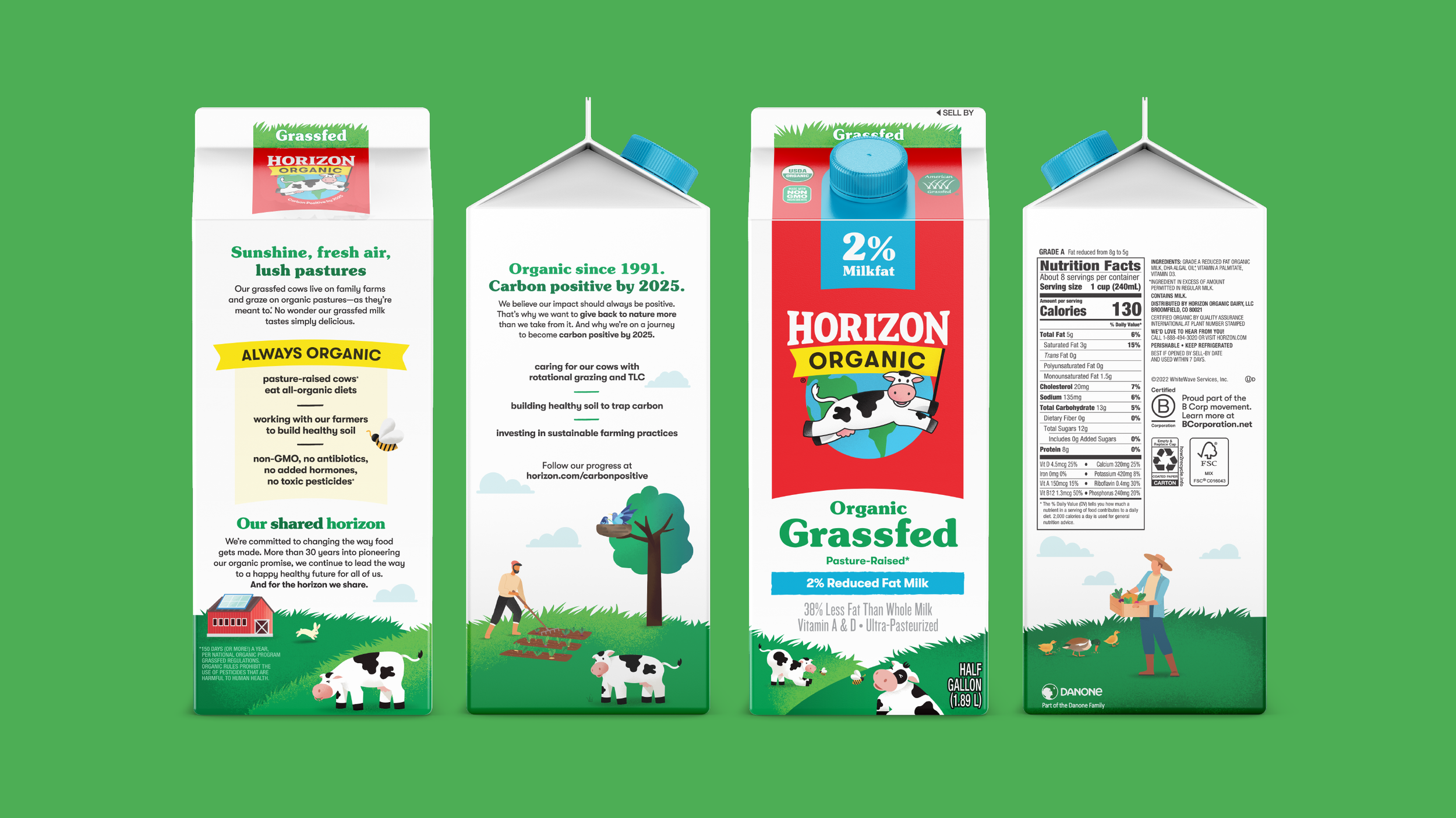
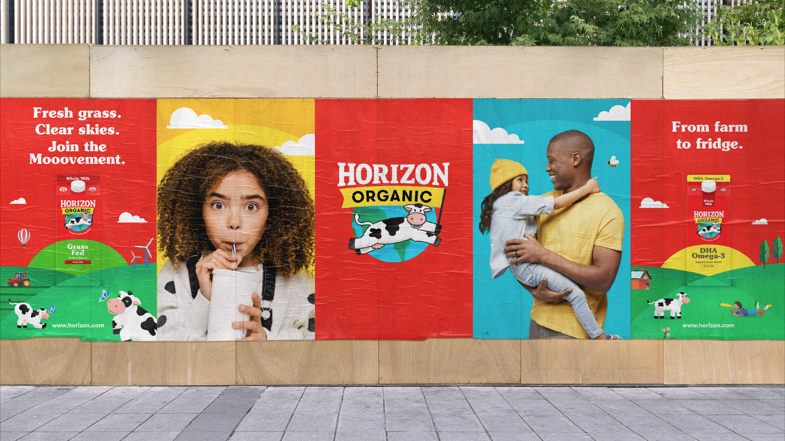
Results: Horizon being the biggest organic dairy brand has always received the notion that it is a small homegrown company, according to consumers. Keeping that in mind the we created a crafted, but modern look and feel that has loads of personality that consumers relate to. Horizon achieve a more unified look on shelf, owns the color red and Happy the cow as our mascot, while increasing ease of navigation and communicating our purpose lead mission. The Horizon rebrand received an international design award from Graphis Magazine.